-

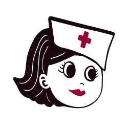
Nursing Burnout: Work Life Balance and Reclaiming your Life
A reader writes: I’ve been working 12-hour shifts back-to-back for the past month, and last week I broke down in tears in the break room. I love being a nurse, but I’m exhausted and can’t seem to recover. How can I manage this burnout before it gets worse? First, let’s acknowledge what happened. You broke…
-
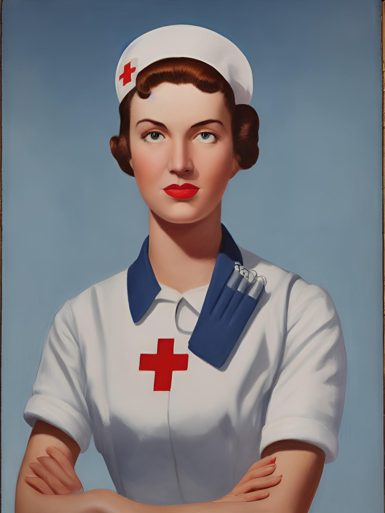
Nursing Advice: How to Deal with a Challenging Coworker
Dear NursePixel: There’s a nurse on my team who constantly undermines my decisions and talks behind my back. Last week, she even questioned my competence in front of a patient. How can I address this conflict without escalating it? Let’s get real for a minute. Being a nurse is tough enough without having to deal…
-
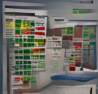
Some Ideas for a Healthcare Dashboard
When I’m at work, I sometimes think about having the perfect healthcare dashboard. I use EPIC at work, and for the most part it’s adequate. But the dashboard that I see each day when I open EPIC is not useful to me at all. I’m not able to easily customize it, and so I just…
-
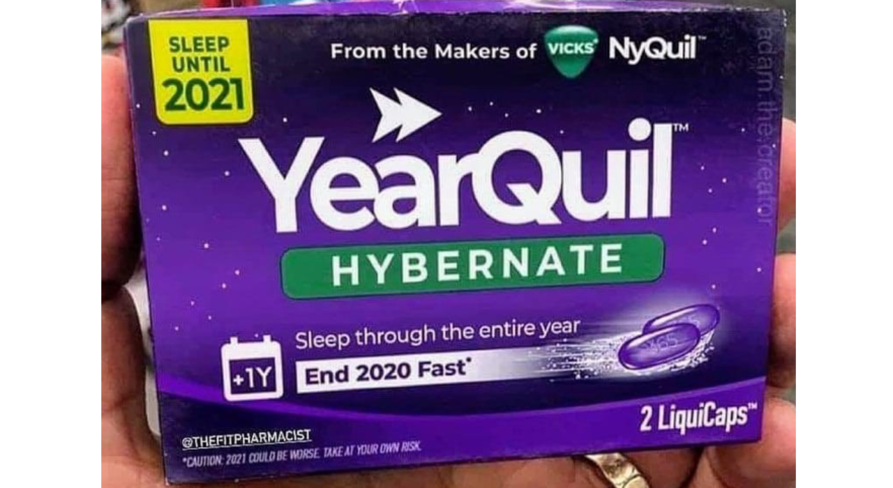
The Covid Diary that never was
On March 20, 2020 I created a blog category called, “Covid Diary.” I had just come back from a vacation, and while I was away, the world had changed. COVID-19 went from being a blip on my news feed to a full on worldwide panic. I had this idea in my head that as a…
-
A Tale of Entry Level Hospice Nursing.
2016 was the year I finally broke into hospice nursing. I had taken a 6 year hiatus from nursing, in order to stay at home with my kids. I honestly wasn’t even sure if I wanted to keep being a nurse. But other job prospects seemed non-existent. The twins were in kindergarten. I had just…